ヴァージニア・リー・バートンの絵本の特徴とメッセージ
文章の入れ方
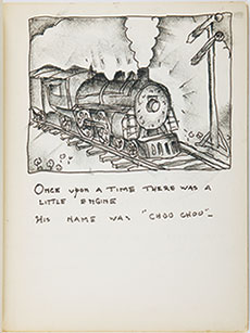
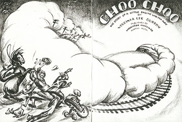
絵本の本文を、彼女は画面全体の中のデザインの一部と考えました。そのため文字をただ羅列するのではなく、決められた形の中に入れ込みます。タイプライターで文章を打ち出し、それをあらかじめ定めておいた形のスペースに入れ、はみ出した言葉をはさみで切ったり、次のラインにはめ込んだりして本を完成させました。例えば『マイク・マリガンとスチーム・ショベル』の中では、ある所は道路のカーブにそって半円形の中に文章が書かれ、また一日で地下室を掘ったメアリー・アンを、どのように地上にあげるか人々が話し合っているページでは、ゆらゆらと寄せては返す波のような絵に合わせて字が並べられています。人々がああでもない、こうでもない、と意見のまとまらない様子が察知されます。『ちいさいおうち』の原書では、最初のページに夫ジョージへの献辞(子どもたちがジョージと発音できなくてドージーと呼ぶのでバートンはその呼び名で書いている)がひなぎくの花輪の中に書かれ、最初の本文は、入口に向かうほど細くなる「おうち」へのアプローチの中にうまくはめ込まれています。トラックで救い出された「おうち」が、田舎の道をぐるぐると長い道のりを巡る所では、文章もまた平行してくねくねと曲がった形の中に入れられています。『いたずらきかんしゃちゅうちゅう』ではもっと顕著で、ちいさな町の下の文章はほとんど正三角形に近い形になり、逃げだした「ちゅうちゅう」が迷走するページでは、線路と並行して同じように曲がった細長い型の中に、あたかも「ちゅうちゅう」の揺れ動く気持ちをそのまま表すかのように書かれています。
なお、『いたずらきかんしゃちゅうちゅう』は字の大きさに工夫が凝らされていて、発刊当時「音が聞こえる字」と絶賛されました。ベルの音には、DING DONG DING DONGとひときわ大きな活字が使われ、ブレーキをかけると、小さなsが7つ続いた後、突如SSSSWISHと大きな音を立てて止まります。「ちゅうちゅう」が廃線の中に迷い込み、座り込むところでは彼女の溜息にそって大文字から小文字へ、やがてch...からa..a..へと消え入りそうな字に変化して、字を見るだけで途方にくれ疲れきった「ちゅうちゅう」の気持ちが子どもたちに伝わるのです。日本語版でこのバートンの工夫が十分に生かされていないのは残念です。
『ちいさいおうち』試作本より、1942、ケープアン・ミュージアム所蔵
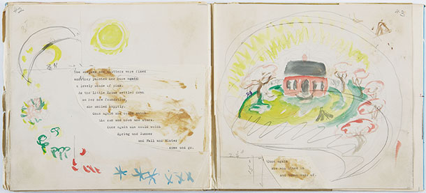
スケッチブックより、制作年不明、
アリスティデス・デメトリアス蔵
『いたずらきかんしゃちゅうちゅう』より
Features and Messages of the V.L. Burton’s Picture Books
Layout of Text
She took text of a picture book as a part of the design of a page. Text is not a simple line of letters but arranged in a certain shape. The text was typed and arranged in a predetermined shape of space. The words pushed out were cut with scissors or inserted into the following line to complete the book. For example, the text was arranged in a semi-circular shape along a curveture of a road in “Mike Mulligan”. In a page where citizens discuss how to pull Mary Anne excavating a basement in a day out onto the ground, the letters are lined along the illustration like waves breaking on the shore and retreating. The line of letters indicates how people are expressing different opinions without reaching conclusion. In the original version of “The Little House”, there was acknowledgement to her husband George (written as Dorgie as her sons called him) in the circle of daisies in the first page.The first text was embedded in a taxiway to the house tapered toward the door. The house rescued on a truck go along a long crooked road in the countryside where the text is aligned in a crooked shape parallel to the road. “Choo Choo” is much clear in the concept. The text below a small town are arranged in almost equilateral triangles, whereas in the page where Choo Choo strays the text is in a narrow rectangular space in parallel to the track, reflecting rollercoaster-like change of feelings of Choo Choo.
There is another elaboration in font size in “Choo Choo”. It was highly praised when first published, saying “The letter produces sound.” DING DONG DING DONG, the sound of bell is in specially big fonts. When applying the brakes, seven s’s are followed by a big sound of SSSSWISH to stop. When Choo Choo strayed into a dead track and is exhausted to sit down, the words changes from uppercase to lowercase then to ch... and then disappearing into a..a... The change in fonts communicates how Choo Choo feels at a loss and fatigued. It is a pity that this design of the text is not incorporated in copies of Japanese translation.
From The Little House Dummy Book, 1942, Collection of the Cape Ann Museum
From Sketchbook, Undated,
Collection of Aristides Demetrios
From “Choo Choo”